The third & final course in Google's UX Design series - a user experience for social good.
Designing for a social cause, I began with a food donation app to serve local groceries to donate produce to the needy.

OVERVIEW
The Product
Project Duration
The Problem
The Goal
Responsibilities
Daan is an organization focused on food donation. The organization collects food mainly from local businesses & groceries who have leftover food packets & produce which may go to waste.
January 2022 to March 2022.
Daan food donation looks to tackle the issue of food wastage by sourcing food packets from groceries.
Design an app that will facilitate the collection of donated food items & help local businesses manage their food waste.
Conducting research, digital wireframing, low and high-fidelity prototyping, conducting usability studies, iterating on designs, determining information architecture, and responsive design.
I adopted a Design Thinking approach to go about the design process from beginning to end:
-
Empathize with users
-
Define user pain points
-
Ideate for design solutions
-
Create wireframes, mockups & prototypes
-
Test designs to get feedback
RESEARCH
Secondary Research
Interviews, User Stories & Personas
I observed the websites of competitors such as No Food Waste, Share the Meal & Olio. This helped gain a broader perspective of how I would want the website to feel like.
A primary user group identified through research were local businesses who would make up a majority of the intended target.
Following this, I began gathering insights from 3 other users on their experience using these apps in the form of interview questions, creating user stories and personas from this data I gathered.
Pain Points
01
Time
Users wish to complete process quickly.
02
Information
Text-heavy menus in apps are often difficult to read and navigate.
Frame Design Question
The above findings helped me further narrow down on the problem statement, leading me to frame my design question.
"How might we improve the donation experience for a social good with a mobile-app and a responsive website?"
DESIGN ITERATION
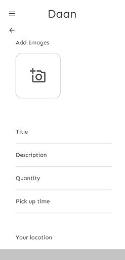
Digital Wireframes
Taking the time to draft iterations of each screen of the app on Figma ensured that the elements would be well-suited to address user pain points.
I began with a minimalistic look on my designs, which also consisted minimum screens within the user flow.
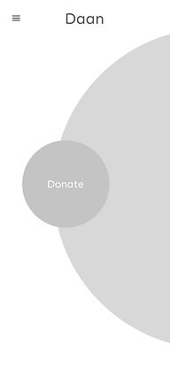

Low Fidelity Prototype
Using the completed set of digital wireframes, I created a low-fidelity prototype. The primary user flow I connected was to donate food, so the prototype could be used in a usability study.

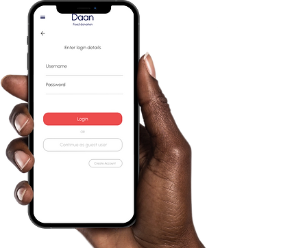
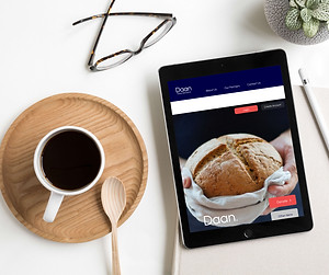
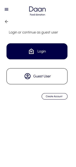
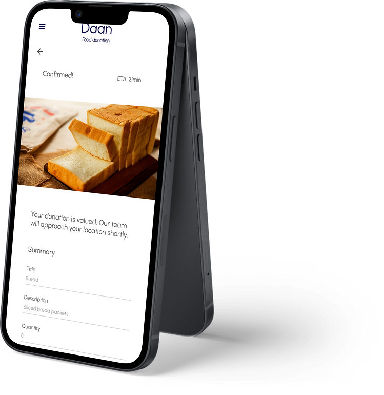
Final Designs
The low-fidelity prototypes were followed up by mockups and high-fidelity prototypes. This gave the final look and feel of the product on completion of a usability study.


TESTING
Feedback & Usability Study
Based on my design wireframes, mockups and prototypes, I went ahead with testing the product with my chosen test users at different stages. The following was the feedback I received and worked on as a result.
01
Minimalism
People want easy & quick approach to user flow, such that it can be done often.
02
More Details
People felt there could be more details such as no of days for which food will be available.
03
Aesthetics
Users wished for a more pleasing UI
04
Expiration dates
People preferred clear indications of when food items would expire.
05
Customization
Users want more customization options.
Findings from the study led to several changes in design and multiple iterations, some of which are shown below:

Before

Worked on a minimalistic & aesthetically pleasing homepage and user flow.
After
Before

Worked on aesthetics with appropriate typography & white space.
After
GOING FORWARD
Takeaways
Working on the initial design question I set out to answer, I have worked on designing a user experience for a social cause to enable a user to easily donate food & other items by designing a simple & concise user flow.
I learned that even though the problem I was trying to solve was a big one, diligently going through each step of the design process and aligning with specific user needs helped me come up with solutions that were both feasible and useful.
Next Steps
01
Conduct research on how successful the app is in reaching the goal to donate food waste.
02
Add more educational resources for users to learn about food waste.
03
Provide incentives and rewards to users for successfully donating their food waste.