As part of Google's UX Design course, I was required to complete certain projects, the first of which involved designing a dedicated mobile app using Figma, for a hypothetical business or organization.
From a list of randomized design prompts, I began working on designing an app to order coffee from a popular coffee store chain. This was the first ever UX design project I would be working on.

OVERVIEW
The Product
Project Duration
The Problem
The Goal
Responsibilities
CoffeeHouse is a coffee store chain located in the suburbs of Mumbai. It aims to serve quality coffee with local flair. They offer a wide spectrum of competitive pricing.
CoffeeHouse targets customers like commuters and workers who wish to order a coffee either from their home, workplace or even those who prefer pickups.
March 2021 to August 2021
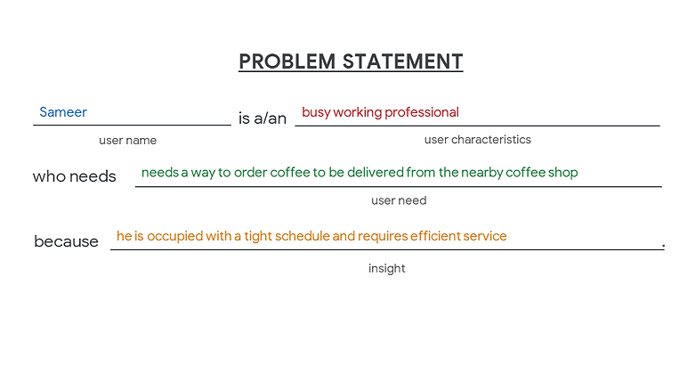
Busy workers or commuters lack the time to visit or spend time at a coffee shop.
Design an app for CoffeeHouse that allows users to easily order a coffee of their choice with an option of delivery or pickup.
Paper and digital wireframing, low and high-fidelity prototyping, conducting usability studies & research, and iterating on designs.
I adopted a Design Thinking approach to go about the design process from beginning to end:
-
Empathize with users
-
Define user pain points
-
Ideate for design solutions
-
Create wireframes, mockups & prototypes
-
Test designs to get feedback
1
Empathize
Research
I started with primary & secondary research on other coffee ordering and food delivery apps such as Starbucks and Zomato, understanding the user flow, and considering the ease of use from start to finish.
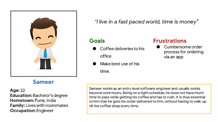
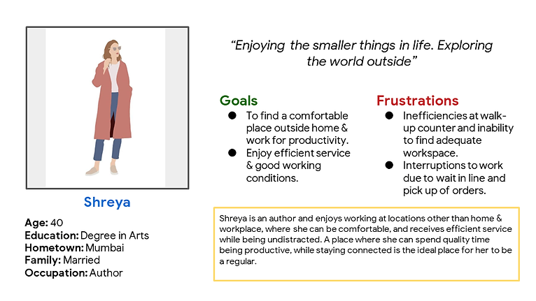
A primary user group identified through research was working adults who would make up a majority of the addressable market.
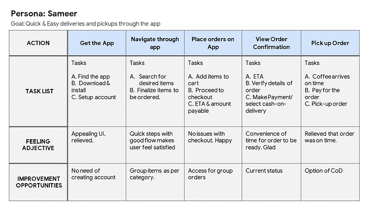
User Personas
Following this, I began gathering insights from 4 other users on their experience using these apps in the form of interview questions, creating empathy maps and personas from this data I gathered.
2
Define
Pain Points
01
Time
Working adults are too busy to spend time on going out to get a coffee
02
Waiting Period
Customers opting to pick up their order do not wish to wait in line.
03
Information
Text-heavy menus in apps are often difficult to read and order from
User Story

Problem Statement
Frame Design Question
The above findings helped me further narrow down on the problem statement, leading me to frame my design question.
"How might we improve the ordering experience for working professionals with a dedicated mobile-app?"
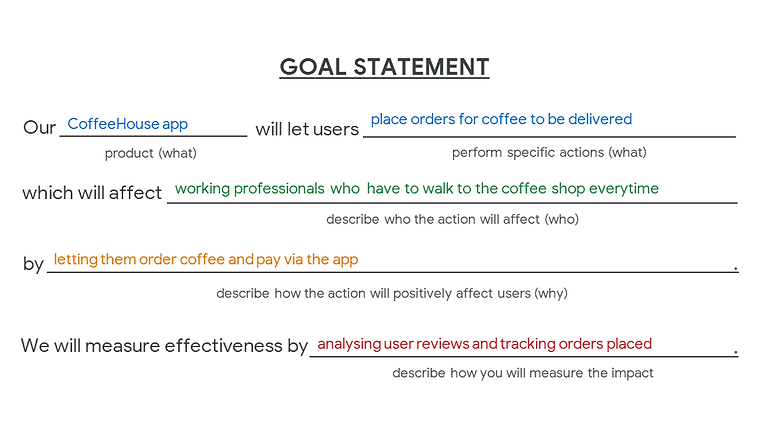
Goal Statement
User Journey Maps

3
Ideate
DESIGN ITERATION
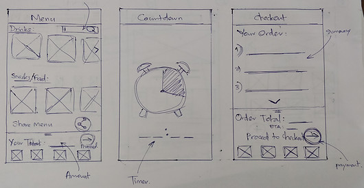
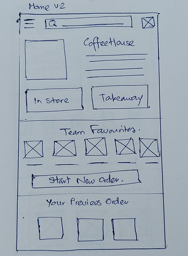
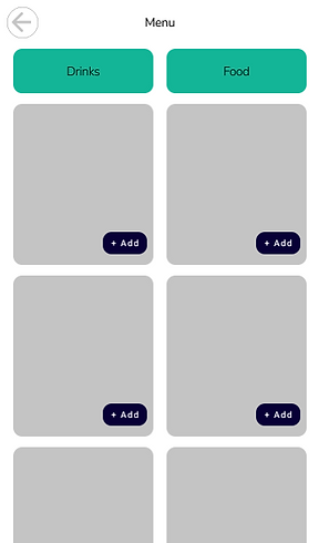
Paper Wireframes
Taking the time to draft iterations of each screen of the app on paper ensured that the elements that made it to digital wireframes would be well-suited to address user pain points.
I had originally intended to add a Self or Group order option, but decided otherwise, based on feedback from test users.

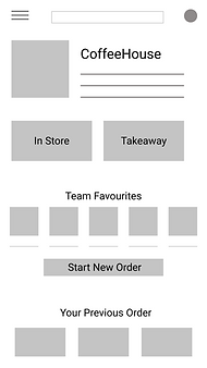
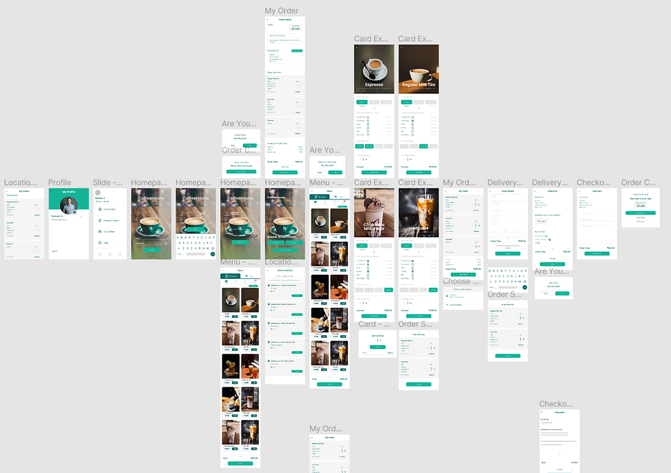
Digital Wireframes
As the initial design phase continued, I began designing my screen sketches on Figma, based on feedback and findings from the user research.

4
Prototype
Low Fidelity Prototype
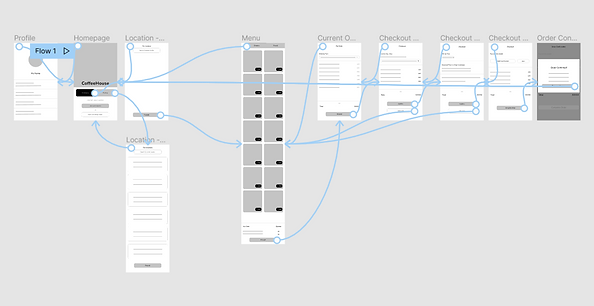
Using the completed set of digital wireframes, I created a low-fidelity prototype. The primary user flow I connected was ordering a coffee, so the prototype could be used in a usability study.
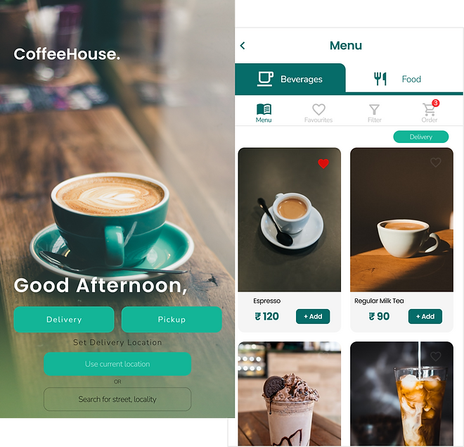
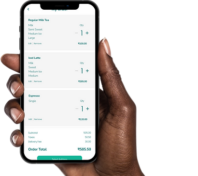
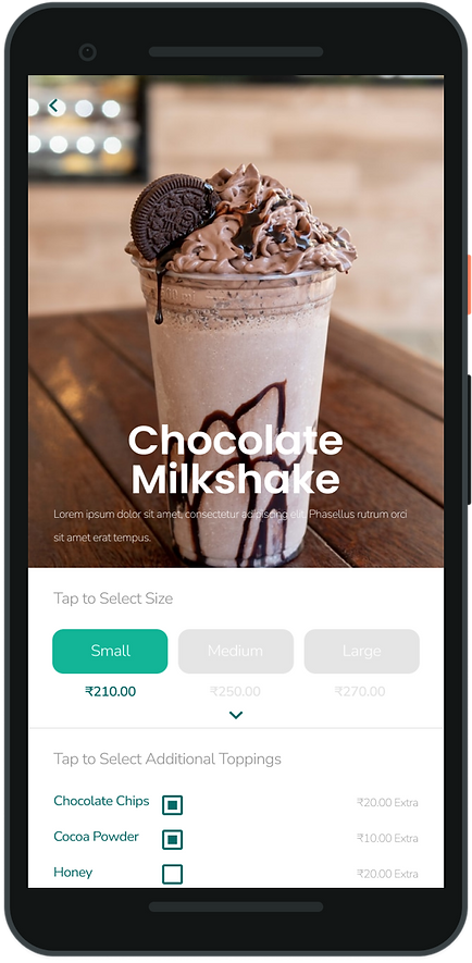
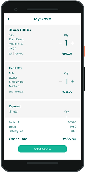
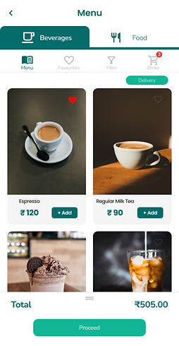
Final Designs
The low-fidelity prototypes were followed up by mockups and high-fidelity prototypes. This gave the final look and feel of the product on completion of a usability study.


5
Test
TESTING
Feedback
Based on my design wireframes, mockups and prototypes, I went ahead with testing the product with my chosen test users at different stages. The following was the feedback I received and worked on as a result.
01
Time
Users wish to order a coffee quickly
02
Aesthetics
Users wish for more appealing visuals
03
Redundant Information
'Group Order' function seems redundant.
04
Added Functions
Customers want a Delivery or Pickup option
05
Customization
Users want more customization options.
Usability Study

Findings from the study led to several changes in design and multiple iterations, some of which are shown below:
Before
Worked on a well structured & aesthetically pleasing UI for the order menu, summary, checkout & payment pages.
After

Before

I worked on redesigning the homepage and user flow, from what it was earlier. I was also advised to do away with Group order options since it seemed redundant.
After
GOING FORWARD
Takeaways
Working on the initial design question I set out to answer, I have worked on designing a dedicated mobile-app to enable a user to order delivery or pickup of their choice of coffee by making an easy to use & aesthetically pleasing user flow, as per the feedback & comments received.
While designing the CoffeeHouse app, I learned that the first ideas for the app are only the beginning of the process. Usability studies and peer feedback influenced each iteration of the app’s designs.
Next Steps
01
Conduct more user research to determine any new areas of need.
02
Work on including more accessibility features.
03
Involve more stakeholders for research, testing and design phases